Feature Article.
Earlier this week as the Bass interview team were deciding on a well known up and coming artist from East London to interview in the first issue of Bass. Early last Monday we contacted the artist known as Snatch. We arranged to meet up at his brand new studio in his central London apartment where we spent the day
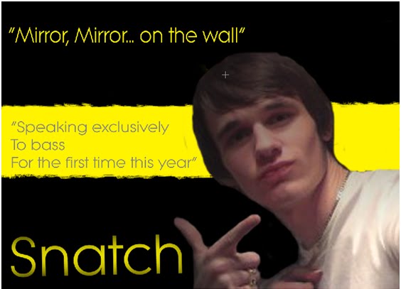
As soon as we met Snatch, we straight away noticed that he was a true rocker. Just by the clothing he had on, baggy jeans with chains and rips, followed by a large red t shirt with various fashionable rips over it. As we began touring his luxury apartment, just like his clothing, we noticed that he lived in a rock-like environment. There were numerous musical instruments in random places in each room.
Once the tour was finished we settled down to a nice cup of tea where we began to question the popular rocker.
Bass: So then ‘Snatch’; let’s get straight into it, what inspired you to be a young rocker?
Snatch: Well it all kicked off when I was a young lad. My mum and dad played the biggest part in inspiring me in my younger stages, There favourite music was rock, even if I didn’t like it, it was hard to hide from it. Every morning, night and evening rock music would be pulsing through the walls of the flat, neighbours used to complain all the time. We were even threatened to be evicted from the flat, but this didn’t stop my hardcore rocking parents! I took to the idea of rock music very early and received my first drum kit and guitar at the age of 6, from then i did lessons for 10 years till i was 15, by this time I had nearly every skill under my belt.
Bass: From that point, how did you jump from being a normal boy doing guitar lessons, to actually rocking for a profession?
Snatch: As I was from a rundown area in central London, I could only dream of taking it further, as you said, making it a profession, but you know what they say, dreams can come true. It all stemmed from a talent show held in my school. The only experience I had of performing was from previous talent shows in school, so i was used to the same audience, exept this one time where i noticed an unfamiliar face watching from the door at the far end of the hall. I thought nothing more of it.
Friday, 7 May 2010
Thursday, 6 May 2010
evaluation
Evaluation
My Magazine uses a range of distinctive conventions of magazines, yet challenges and develops some aspects to make my magazine unique and different from the others already available in the market. For starters, on the front cover, my title block is in the top left corner followed by a circle containing the price in large font. I also included my central image with anchorage text just above it which states ‘Exclusive interview with Snatch’. Below the central image is a puff which stretches from left to right across the page and states ‘This weeks top 40 uk downloads’. All these aspects reflect the typical conventions of magazines. I also maintained a consistent house style throughout, by using the same font and colours – Black, Yellow, Red and Grey. However, to build up the forms of conventions on the front cover; I gave a ripped outline effect to my central image to enhance the rock theme of my magazine I have challenged few conventions of the front cover and have done so primarily inside the magazine, so that a regular reader is not put off by an unfamiliar front cover. However I chose yellow for the background colour on the front cover, because it is unconventional and attracts readers more than a plain black or white cover does. Therefore, inside I presented my images in non-conventional ways by once again adding a ripped edge effect around the main image. This should attract the audience and provide a different style of magazine, yet still not divide the readers.My magazine aims to characterize certain social groups, especially the target audience. It aims to represent young males and females between the ages of 15 -24 that live in the UK who are not as wealthy as readers of more expensive music magazines. This representation is reflected in my feature article about snatch who is from the same background as my target audience, a 16 year old rocker from a lower class background to a well known British rocker. This Real life story could be inspiring for the readers who are also young and mainly from lower class backgrounds. As a result, by targeting a younger lower class audience, I am challenging the conventions of other magazines as the majority of them are only targeted at males. I have tried to create a sense of belonging and welcoming towards my readers by using words like ‘Exclusive’, making them feel privileged that Bass is providing them with exclusive information.
Looking back on my research on publishing companies, if I were to choose one to distribute my magazine I would select IPC media to distribute my product as they publish both niche and mainstream magazines. They have also previously worked with rock magazines before, such as 'NME'. Therefore they would have experience and knowledge on this matter. Also, from my research, I learnt that just under 50% of the uk read an IPC media magazine, this immediately my magazine an opportunity to attract a wider audience than expected.As stated previously, the audience for my magazine are lower class males and females aged 15 - 24 that live in the UK and have an interest in rock and are interested in up and coming new artists from the same background and environment as them. I have chosen this target audience because there are very few magazines the market that attracts this type of audience where not only do they provide them with the latest exclusive information, but also relates to them by delivering articles about young up and coming artists like themselves. Once again, looking back on my research and knowledge I decided that as the magazine will be published in the main towns and cities such as London and Manchester, I will aim to target the average young person between the age range of 15-24. Consequently, this is why I used images of a young average male from east London. As a result of this, the magazine may then attract more females than expected, because of the popular young male in my magazine.
To attract my target audience, I used a black rock – like font with a vibrant red shadow behind it for my title block to immediately give the magazine a rock theme. This is then followed by the cheap price tag of ‘99p’ once again opening doors for an even wider audience as this is extremely cheap for a magazine. The picture I used has a direct mode of address to immediately draw in the audience new-readers on the first issue, but as the magazine issues progress, direct contact will be maintained.
From the beginning of my coursework I have learnt about two key vital programs in my production; Photoshop and Blogging. This is the first time I ever used Photoshop, every single skill Evident in my production work had been learnt this year. For example feather tools, resizing and moving, fading an image, how to brighten and darken lighting on images, how to highlight objects, glow, add shadow, change colour, filter, colour pick and fix the object, how to sharpen images, etc. On Blogger, I have learnt specific skills on presentation, It has been a useful tool to gather and present information. For example to gather information i used polls and allowed users to comment on my work, such as my classmates and my teachers who provided feedback and I was able to go over my work and improve it. I have also learnt how to navigate. I have also learnt how to use Adobe Picture Illustrator as well as Photoshop, to arrange images and insert text. However, I found Photoshop easier to use and it gave me better results, so I’ve use Photoshop for most of my production work.
Wednesday, 5 May 2010

Tuesday, 4 May 2010

Monday, 3 May 2010


PROPOSAL
The genre I have chosen for my music magazine is rock, with exclusive features of recognized artists. The rock genre has a huge audience that are easy to appeal to although slightly demanding. The target audience I have chosen are 16 – 24 year old males and females; this magazine is needed in the market as there are not many rock magazines that appeal equally to both genres. I will target this multi gender audience by involving articles and features about artists who also appeal to both genders.
The genre I have chosen for my music magazine is rock, with exclusive features of recognized artists. The rock genre has a huge audience that are easy to appeal to although slightly demanding. The target audience I have chosen are 16 – 24 year old males and females; this magazine is needed in the market as there are not many rock magazines that appeal equally to both genres. I will target this multi gender audience by involving articles and features about artists who also appeal to both genders.

Q Magazine
Q is a music magazine aimed at males of the ages between 22- 44. It's for people interested in a variety of different types of music, but usually has its main focus as Rock. The target audience would also be interested in reading articles based on these artists.
We can tell from the puffs on the front cover, that the magazine will feature a range of different artists such as 50 Cent, Muse and Snow Patrol. Also, the puff "The 10 Best new Acts" attracts the audience because of the buzz word "Best".
The buzz word makes the reader feel as if they ar getting something extra and exclusive that not everyone has. The central image is of Cheryl Cole; she has a direct mode of address which shows her connecting with the audience. Cheryl is on the front cover of Q so that she can help promote herself and her music, as she has just recently released her debut solo album.
The anchorage text reads " 3 words... Cheryl Cole
Rocks", this is a reference to her album '3 words' and Q magazine made a clever approach in making the next words that followed literally three words. The word "Rocks" is in large capitals so it stands out, this also will make the reader believe that Cheryl is no longer a pop singer and is now a rock star!
Rocks", this is a reference to her album '3 words' and Q magazine made a clever approach in making the next words that followed literally three words. The word "Rocks" is in large capitals so it stands out, this also will make the reader believe that Cheryl is no longer a pop singer and is now a rock star!
As the magazine is dominately aimed at males, the central image being a pretty woman like Cheryl Cole will make it look more appealing. From this image Cheryl is giving the impression that she has an 'edge' to her and the image is in relation to Sin City, a film which regular readers of Q would be familiar with.
The main colours of the magazine are red, black and white. These colours also match the Sin City and 'rock chick' kind of theme. Red is a very dominant colour, that can also be seen as sexy, stong and powerful. White stands out amongst the mainly black background and all the colours are quite sophisticted.
The font used is simple block capitals because they are simple to read and don't take the main focus away from the actual magazine.
The slogan is written along the top of the magazine, this is good because it means it will stand out and be seen even when the magazine is stacked on shelves behind others. It says "The UK's biggest music magazine". This shows that a lot of people read it and that it is a confident, well known magazine. Not many music magazines cater for all different genres of music, however Q magazine, is one of the few that does.

NME magazine
NME is aimed at young males aged 15-24. The magazine doesn't really contain in-depth articles about artists, but rather features in montages of pictures. The magazine is more of a newspaper than a magzine, and features reports on artists and recent shows. We can tell from the title block that the magazine is trying to attract a young audience. We know this because of the bold lettering as it is very bold and eye catching. The colours are also very bold (red and black). The title of the magazine is pronounced as 'Enemy' , it suggests that the magazine enemy is the popular culture.
NME is aimed at young males aged 15-24. The magazine doesn't really contain in-depth articles about artists, but rather features in montages of pictures. The magazine is more of a newspaper than a magzine, and features reports on artists and recent shows. We can tell from the title block that the magazine is trying to attract a young audience. We know this because of the bold lettering as it is very bold and eye catching. The colours are also very bold (red and black). The title of the magazine is pronounced as 'Enemy' , it suggests that the magazine enemy is the popular culture.
The central image is of Gerrad Way from the band 'My Chemical Romance'. It uses a direct mode of address which shows that the magazine wants it to have a connection with the audience. However, his body is twisted away from the audience and only half of his face is showing. This shows that the magazine wants us to know him, but not fully; it makes it seen mysterious. He is on the front so he can promote My Chemical Romance's new album. He will also help to bring in a wider audience.
The anchorage text says: "My chemical romance on their punk comeback album"- this tells the audience that it is something new and they have come back with a bang! The colours used are red, white and black. These colours are very bold and also looks quite dangerous. They chose three main coloursto focus on because using too many would not make the image look as appealing to the audince. NME does its best to attract readers by featuring various artists and bands on the front cover, they also mention up and coming artists that do not usually get coverage in other music magazines.
Subscribe to:
Comments (Atom)